Back in 2003 I got a call from then director of the Youth In Arts Italian Street Painting Festival, Sue Carlomagno, about a crazy idea she was dying to share with me. ‘How would you like to tackle the Sistine Chapel ceiling?’
I knew she & her husband Joe were planning something big for the 10th Anniversary event but I didn’t realize how big! Talk about ambitious – over 300 figures and yards of architecture, this masterpiece would surely be a show stopper if created. A feat never before undertaken at any festival in the world this was going to be a dream project for many folks involved.
Sue asked me to spearhead the project as I had extensive experience in art directing / painting large mural projects and was used to managing teams of artists. I had recently finished off several large Vegas casino mural projects which involved creating over 11,000 sq. ft. of images. I was game and eagerly jumped into the project planning. Additionally, Sue honored me with a request to create the original art for the event poster: a portrait of Michelangelo’s Delphic Sibyl. I used chalk pastels on paper and the original art was framed and then auctioned off as part of the festival fundraising.
She gave me the parameters I had to work within – here’s how much pavement you get (we estimated that we could draw the image at about 1/2 scale the original, at 75′ x 25′) and here’s how much time you get to make it – only 6 days! That was it – the rest was up to me to design as was necessary. The first thing we did was estimate how many artists it would take to make this large image & then contact those who had some festival experience to see if they were interested. Everyone we approached enthusiastically said YES, so we had our core crew of 12 artists. We then recruited an additional 6 artists, including Santa Barbara I Madonnari Festival director, Kathy Koury, to assist with architecture and detailing.
Because the artists selected were all of similar caliber and style in their abilities, we invited them to select from sections of a ‘map’ I created of the painting, which was divided like a puzzle – it was the most democratic manner we could imagine of assigning them to the various segments of the drawing. Oddly enough, most everyone chose a different area and many of the artists were able to draw the area that most appealed to them. Perfect! Next I developed a consistent palette we’d use when drawing, helping to keep the image unified. Sponsorship from Sennelier Pastels and Koss Chalks helped with the costs – pastels are expensive!
In preparation for the event, I spent a few months creating the large master drawings for the architectural framework and the details within, so there would be a consistent component to the work that would tie it all together. The pendentives, the spandrels and the putti, yards of egg and dart molding and lots of corbels! That ceiling has a wealth of detail and invention from the Maestro Michelangelo. With this out of the way, the core artists drawing the figures could focus mainly on that. The artists were encouraged to use either a grid, freehand or pounce methods to transfer their particular figures to the pavement.
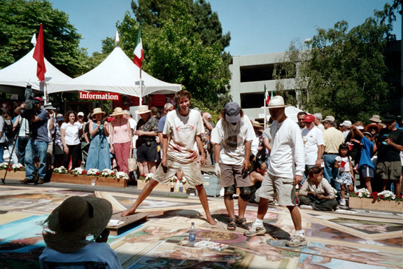 The first day involved the drawing lay-out – we had about 1/2 the team there assisting with this task. It took the entire day to lay out the architecture and framework so that each area was accurate. We had lots of news and media coverage throughout the day (and week) which really added to the local excitement of what we were hoping to accomplish. By day two, all the artists had arrived and had begun drawing out their prospective areas.
The architectural team had the tricky job of working in and around the core artists – they were required to play ‘street painting twister’ by working over already completed areas which is not always easy! Thank God we had lots of cardboard to lay over the art, which keeps the work beneath safe from damage. Their tireless efforts in keeping the colors and detailing exact were greatly appreciated as this contributed to the success of the entire image.
We worked tirelessly for 5 days straight, some folks even worked late at night with lights on. As the days proceeded and the painting grew, we accumulated more assistants from friends and associates. By the last day we had to meet our deadline of 6:00pm and began asking folks from the crowd if they’d be so kind to assist with fill in! They did – it worked! I think we had about 30 people total who had a hand in the making of the painting – it truly was a collective effort.
Needless to say it was a huge success – the painting was gorgeous and each artist had put their best foot forward in bringing this wonderful idea to life. The city of San Rafael came out by the thousands to see it and when the street sweepers came by to wash it away at 2:00am that Monday morning, many were on hand to say good-bye. You just don’t get to see things like this everyday and I know those who saw it will never forget how amazing our Sistine Chapel ceiling was!
The Artists were: Coordinating Artist: Tracy Lee Stum – Panel Artists: Chris & Gary Bennett, Erin Tajime Castelan, Evan Bissell, Genna Panzarella, Julie Kirk Purcell, Tomoteru Saito, Rod Tryon, Melanie Stimmell Van Latum, Mark Wagner, Joel Yau. Architectural Team: Anthony Cappetto, Jeanne Carlson, Lisa Jones, Kathy Koury, Charlene Lanzel, Tim Steele.


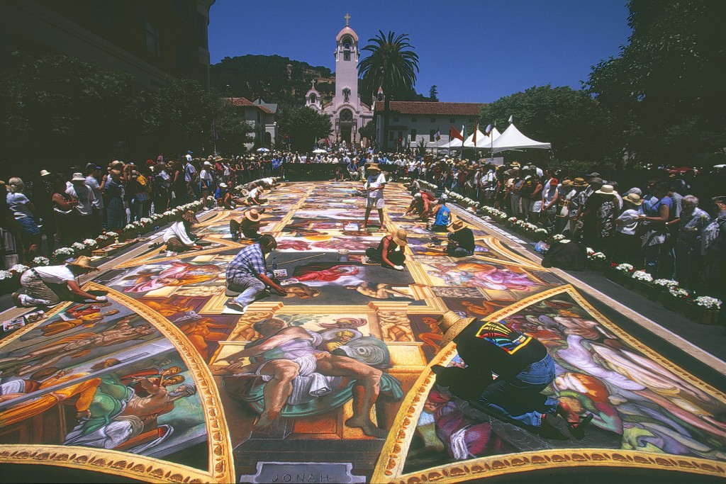

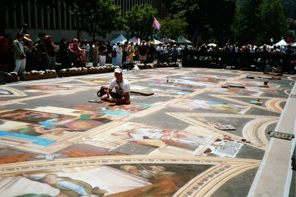
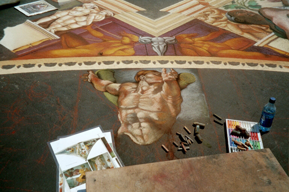
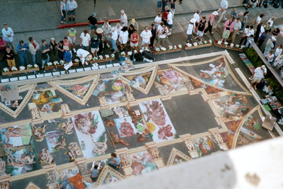
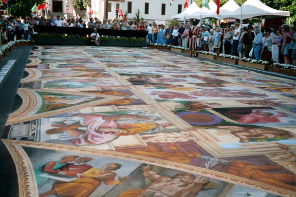


Whatever happens to this amazing artwork? does the rain wash it away?
Yes Martha, typically the rain (& general weather conditions) will remove the drawing. This is an ephemeral art form, which is performance based in nature. It’s really wonderful to see the process and evolution of the image over the course of a few days. However, this Sistine Chapel painting was created on an indoor surface – after the event it was placed into storage.
This is an absolutely amazing work of art. Those of you interested in the subject of street art might enjoy the novel that we (Gina Buonaguro & Janice Kirk) wrote about it (and the Renaissance artist Raphael, a contemporary of Michelangelo), called The Sidewalk Artist. You can learn more about it here: http://sidewalkartist.blogspot.com/p/praise-for-sidewalk-artist.html
Looks better than the original !
Well done.